Imagine this: 60% of global web traffic comes from mobile devices, yet 85% of users abandon sites that perform poorly on their screens. The era of “one design fits all” is dead. With devices multiplying faster than ever (think foldable, AR glasses, 8K monitors), developers need a more innovative approach. Responsive web design isn’t just a trend—it’s survival.
Why pour resources into building separate sites for each gadget when responsive design offers a future-proof lifeline? This blog cuts through the chaos, revealing 10 strategies to craft websites that adapt fluidly, perform flawlessly, and keep users engaged—no matter how they browse.
What Is Responsive Web Design?
Responsive web design is the ultimate solution to the device fragmentation problem. Instead of creating separate designs for every screen size, responsive design uses a combination of flexible layouts, adaptive images, and CSS media queries to adjust the site’s appearance and functionality automatically.
Think of responsive web design as a chameleon for your website. It’s a design philosophy that ensures your site adapts to the user’s device, screen size, and even orientation.
This means your website can transition smoothly from a smartphone to a tablet to a desktop without missing a beat. It’s not just about aesthetics—responsive design also considers user preferences, ensuring accessibility and performance across all platforms.
Top 10 Responsive Web Design Strategies
1. Everything is Flexible
Flexibility is the cornerstone of responsive web design. In the past, flexible layouts were limited to structural elements like columns and text, while images often caused layouts to break when resized. Early attempts at flexibility were rudimentary, allowing only minor adjustments within a few hundred pixels. This approach fell short when transitioning between vastly different screen sizes, such as from a desktop monitor to a netbook.
Today, the concept of flexibility has evolved significantly. Modern techniques allow images, grids, and even typography to adapt fluidly to different screen sizes and orientations. While these solutions aren’t perfect—layouts can still become cramped or illegible in extreme cases—they provide a far more robust framework for handling the diversity of devices. This is particularly useful for devices that switch between portrait and landscape modes or for users who access the same site on both a desktop and a tablet.
Ethan Marcotte’s work on responsive design highlights the importance of fluid grids, fluid images, and intelligent markup. Fluid grids ensure that layout elements resize proportionally, while fluid images scale without breaking the design. Techniques like hiding or revealing portions of images, creating sliding composite photos, and using scalable foreground images are now standard practices for achieving flexibility.
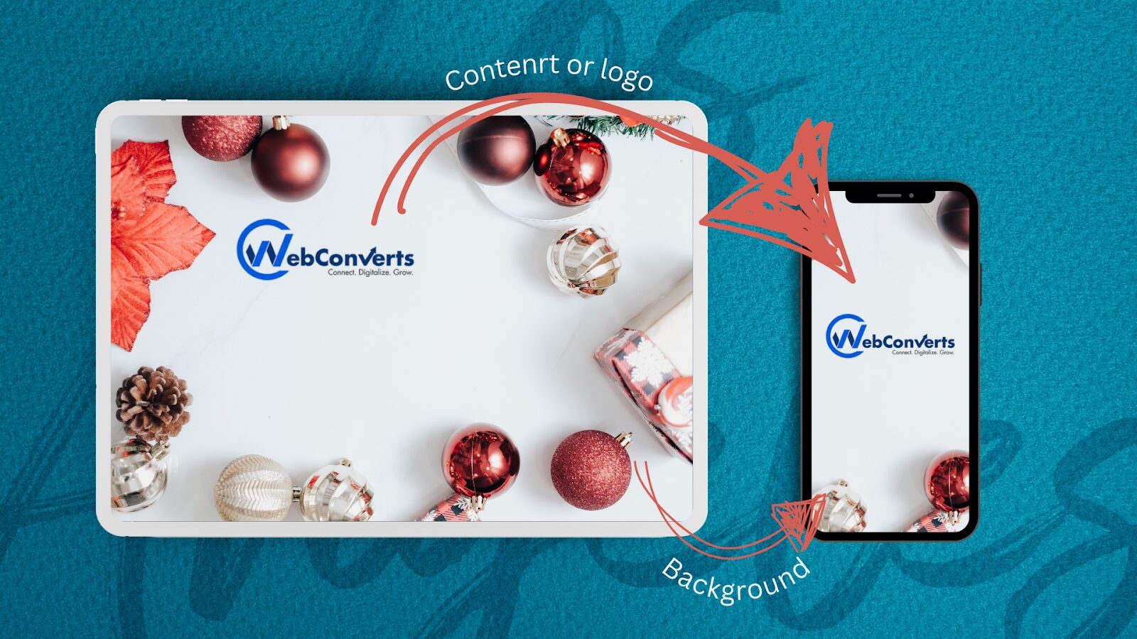
For example, consider a logo design where the image is divided into two parts: the background (an illustration) and the foreground (the website name). The background is set to maintain its size and crop as needed, while the foreground resizes proportionally to ensure the website name remains visible and legible. Here’s how this might be implemented in code:
HTML CODE:
<h1 id="logo">
  <a href="#">
    <img src="site/logo.png" alt="The Baker Street Inquirer" />
  </a>
</h1>
In this example, the h1 element contains the logo image, with the illustration set as a background and the text resized dynamically. This approach ensures that the logo remains functional and visually appealing across different screen sizes.
However, even with these techniques, challenges remain. For instance, resizing a logo too much can result in poor image quality or make the text illegible. While cropping part of the illustration might work in some cases, the ideal solution would avoid compromising the design’s integrity. This highlights the need for thoughtful, user-centric design decisions that balance flexibility with usability.
For developers looking to explore flexible design more deeply, resources like Zoe Mickley Gillenwater’s book Flexible Web Design: Creating Liquid and Elastic Layouts with CSS offer valuable insights. Her work, along with tutorials and best practices, provides a comprehensive guide to mastering fluid layouts and images.
Flexibility in responsive design isn’t just about technical implementation—it’s about rethinking how we approach design to ensure it works seamlessly across all devices, no matter their size or orientation.
2. Screen Resolution Adjustment
The diversity of device screen sizes, resolutions, and orientations, coupled with users’ ability to switch orientations and resize browsers, makes responsive web design challenging.

Historically, designers attempted to group devices into categories and create tailored designs for each. However, this approach is no longer sustainable. The sheer number of devices, combined with the rapid pace of technological innovation, makes it impractical to design for every possible screen size.
For example, Morten Hjerde and his team analyzed over 400 devices sold between 2005 and 2008, identifying standard screen resolutions. However, since then, the diversity of devices has only increased, making it clear that custom solutions for each device are not feasible.

Responsive design uses fluid grids, flexible images, and CSS media queries to adapt content to any screen size, ensuring websites look and function well on all devices.
3. Filament Group’s Responsive Images
The Filament Group’s approach to responsive images tackles two critical issues: proportional image resizing and reduced image resolution for smaller devices. This ensures that large images don’t waste bandwidth or storage on screens where they aren’t needed.
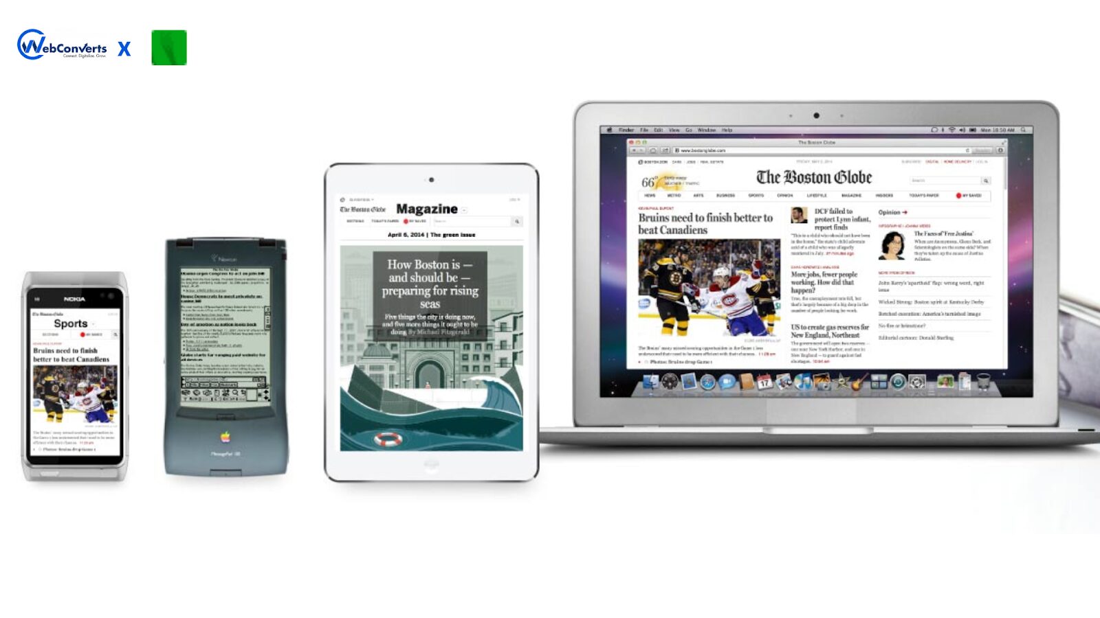
The technique involves a few key components, all available on GitHub:
- A JavaScript file (rwd-images.js)
- A .htaccess file
- An image file (rwd.gif)
Here’s how it works in practice:
HTML CODE:
<img src="smallRes.jpg" data-fullsrc="largeRes.jpg">Run HTML
In this example, smallRes.jpg is the default image for smaller screens, while largeRes.jpg is loaded for screens wider than 480 pixels. The data-fullsrc attribute is a custom HTML5 attribute defined in the provided files.
The JavaScript file dynamically inserts a <base> element, separating responsive images from others and redirecting them as needed. When the page loads, the script rewrites the image sources, ensuring only the appropriate image (small or large) is downloaded. This avoids the unnecessary download of high-resolution images on smaller devices, saving bandwidth and improving load times.
Browser Support:
- Modern browsers like IE8+, Safari, Chrome, and Opera fully support this technique.
- Mobile devices using these browsers (e.g., iPad, iPhone) also work seamlessly.
- Older browsers and Firefox still resize images as expected but download both resolutions, negating the bandwidth-saving benefits.
While this method is effective, it’s worth noting that modern solutions like srcset and the <picture> element have primarily superseded it. These native HTML features offer similar functionality without requiring additional JavaScript or server-side configurations, making them more efficient and easier to implement.
4. Flexible Images
One of the most significant challenges in responsive web design is handling images effectively. Images must be resized proportionally to fit different screen sizes without breaking layouts or compromising quality. Fortunately, there are several techniques to achieve this, with the most straightforward and widely used being the CSS max-width property.
CSS CODE:
img {
max-width: 100%;
}
This rule ensures images scale to fit their container’s width without exceeding their original size.
However, there are caveats. Internet Explorer (IE) does not support max width, but this can be addressed by using width: 100% in an IE-specific stylesheet. Additionally, older Windows browsers may render resized images poorly, resulting in blurry or pixelated visuals. As discussed in Marcotte’s work, this issue can be mitigated using JavaScript.
While the max-width technique is a quick and effective solution, it doesn’t address all aspects of responsive images. A critical consideration is image resolution and download times. Serving a large, high-resolution image meant for desktops to mobile devices can lead to unnecessarily long load times and wasted bandwidth. This is especially problematic for users on slower connections or limited data plans.
To tackle this, developers can employ more advanced techniques, such as:
1. Srcset and Sizes Attributes: These HTML attributes allow you to define multiple image sources for different screen resolutions, ensuring that devices only download the most appropriate version.
2. Picture Element: The <picture> provides more control over which image is displayed based on media queries, enabling art direction and optimized delivery.
3. Image Compression Tools: Tools like ImageOptim or Squoosh can reduce file sizes without sacrificing quality, improving load times across all devices.
For example, using the srcset attribute:
HTML CODE:
<imgsrc="image-small.jpg" srcset="image-small.jpg 480w, image-medium.jpg 800w, image-large.jpg 1200w" sizes="(max-width: 600px) 480px, (max-width: 900px) 800px, 1200px" alt="Responsive Image Example">This approach ensures that smaller devices download smaller images while larger devices receive higher-resolution versions, balancing quality and performance.
In summary, while max-width is a great starting point for flexible images, it’s essential to consider the resolution, download times, and advanced techniques like srcset and the <picture> element to create genuinely optimized, responsive designs.
5. JavaScript for Responsive Design
JavaScript can serve as a fallback for devices that don’t fully support CSS3 media queries. For older browsers (IE 5+, Firefox 1+, Safari 2), the css3-mediaqueries.js library enables media query functionality. Simply include the library in your markup to extend support.
For a more customized approach, JavaScript can dynamically adjust styles based on screen width. Below is a jQuery example that switches style sheets when the browser width crosses a threshold:
HTML CODE:
<script src="https://ajax.googleapis.com/ajax/libs/jquery/1.4.4/jquery.min.js"></script>
<script>
 $(document).ready(function() {
$(window).bind("resize", resizeWindow);
 function resizeWindow(e) {
 var newWindowWidth = $(window).width();
 if (newWindowWidth < 600) {
$("link[rel=stylesheet]").attr({ href: "mobile.css" });
 } else if (newWindowWidth > 600) {
 $("link[rel=stylesheet]").attr({ href: "style.css" });
 }
 }
 });
</script>
This script switches to mobile.css for screens narrower than 600px and reverts to style.css for wider screens.
While CSS media queries are a powerful tool for responsive design, JavaScript adds flexibility for handling edge cases and older browsers. For deeper insights, explore resources like Combining Media Queries and JavaScript.
6. Stop iPhone Simulator Image Resizing
The iPhone and iPod Touch automatically rescale websites to fit their screens, allowing users to zoom in and out as needed. However, this feature can cause issues with responsive designs, as images may shrink unnecessarily, scaling down text and other elements in the process.

To prevent this, use Apple’s viewport meta tag in the <head> section of your HTML:
HTML CODE:
<meta name="viewport" content="width=device-width, initial-scale=1.0">This tag ensures the page width matches the device’s width and turns off automatic scaling, keeping images and layouts intact. For more details, refer to Apple’s documentation on the viewport meta tag.
7. Media Queries
CSS3 media queries extend CSS 2.1’s capabilities, introducing features like max-width, device-width, orientation, and color. These features allow you to tailor styles to specific devices or screen conditions, such as smartphones, tablets, or print layouts. Newer devices like iPads and Android phones fully support these features, while older browsers simply ignore them.
Here’s a basic example of a media query:
HTML CODE:
<link rel="stylesheet" type="text/css"
  media="screen and (max-device-width: 480px)"
  href="shetland.css" />
This query applies shetland.css only when the page is viewed on a screen with a maximum width of 480px.
CSS3 also supports advanced features like orientation (portrait vs. landscape), min-device-width, and max-device-width. For instance, you can create distinct styles for landscape and portrait modes or define layouts for specific screen width ranges.
Instead of linking multiple style sheets, you can embed media queries directly into a single stylesheet for better efficiency:
CSS CODE:
/* Smartphones (portrait and landscape) */
@media only screen
and (min-device-width: 320px)
and (max-device-width: 480px) {
 /* Styles */
}

/* Smartphones (landscape) */
@media only screen
and (min-width: 321px) {
  /* Styles */
}

/* Smartphones (portrait) */
@media only screen
and (max-width: 320px) {
  /* Styles */
}
This approach, popularized by Andy Clark in Hardboiled Web Design, consolidates all device-specific styles into one file, simplifying maintenance and improving performance.
For a deeper dive into media queries, explore resources like Ethan Marcotte’s article Meet the Media Query or Andy Clark’s Hardboiled Web Design.
8. Touchscreens vs. Cursors
Touchscreens are no longer limited to smaller devices—many laptops and desktops, like the HP Touchsmart tm2t, now include touch capabilities. This shift requires designers to consider both touch and cursor interactions in their designs.

Key differences between touchscreens and cursor-based devices include:
No Hover States: Touchscreens can’t display CSS hover effects since touching the screen triggers an immediate click. Avoid relying on hovers for critical functionality; treat them as enhancements for cursor users only.
Ergonomics: Design with touchscreen ergonomics in mind. For example, placing sub-navigation on the right side benefits right-handed users by reducing accidental touches. This adjustment doesn’t hinder cursor users, making it a win-win.
For more insights, explore resources like Designing for Touchscreens. By following touchscreen-friendly guidelines, you can create designs that work seamlessly across touch—and cursor-based devices without compromising usability.
9. Showing or Hiding Content
Responsive design isn’t just about resizing and rearranging content—it’s also about deciding what to show or hide based on the user’s device. While flexible layouts ensure everything fits on smaller screens, not all content needs to be visible. Simplifying navigation, focusing on key content, and converting multi-column layouts into single-column lists are best practices for mobile environments.
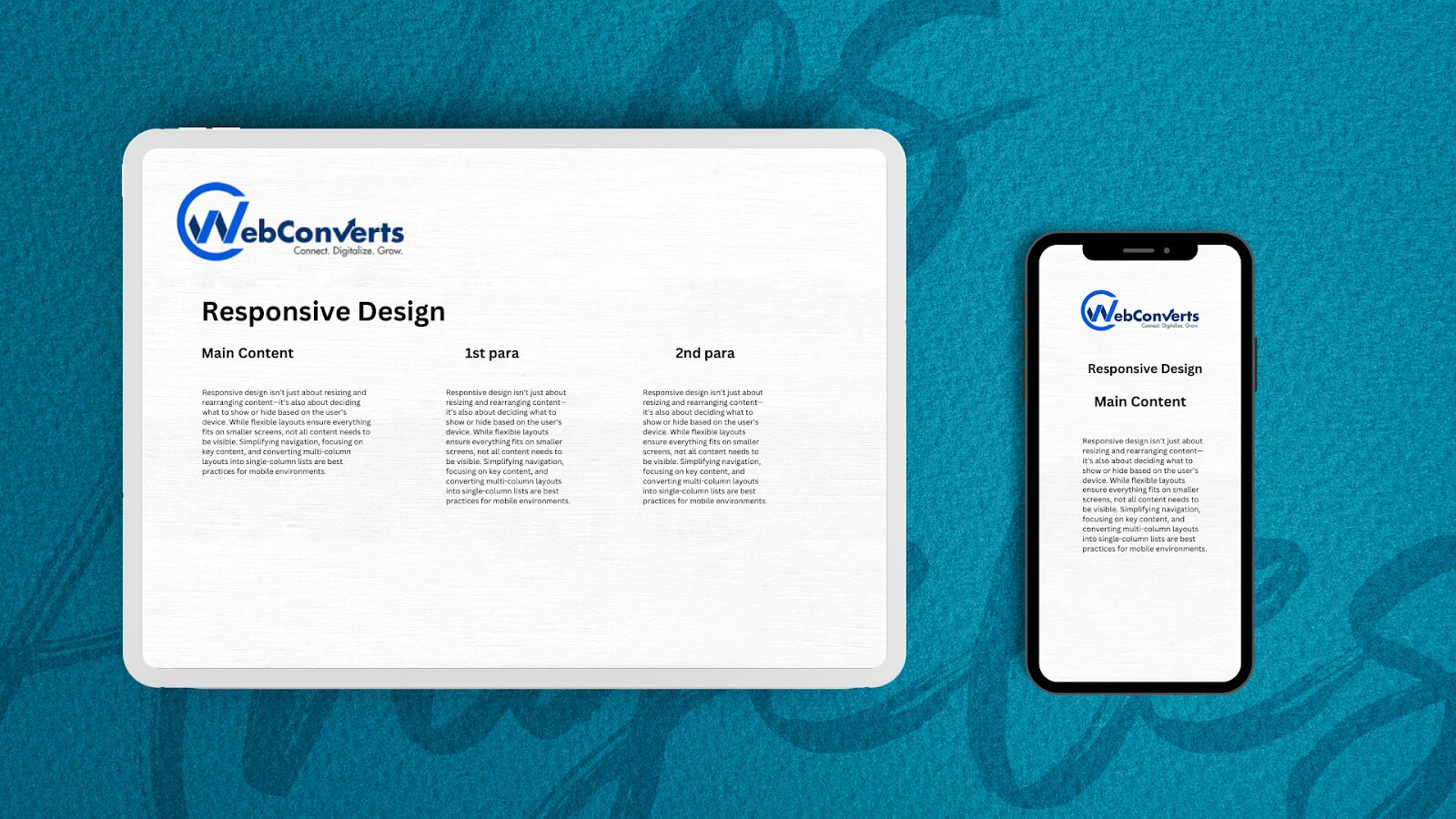
CSS makes it easy to show or hide content using display: none. This property completely removes the element from the layout, unlike visibility: hidden, which only hides it while keeping the space reserved.
Here’s an example:
HTML CODE:

<p class="sidebar-nav">
 <a href="#">Left Sidebar Content</a> | <a href="#">Right Sidebar Content</a>
</p>
<div id="content">
 <h2>Main Content</h2>
</div>
<div id="sidebar-left">
 <h2>A Left Sidebar</h2>
</div>
<div id="sidebar-right">
  <h2>A Right Sidebar</h2>
</div>
<p class="sidebar-nav">
 <a href="#">Left Sidebar Content</a> | <a href="#">Right Sidebar Content</a>
</p>
<div id="content">
 <h2>Main Content</h2>
</div>
<div id="sidebar-left">
 <h2>A Left Sidebar</h2>
</div>
<div id="sidebar-right">
  <h2>A Right Sidebar</h2>
</div>
Default Stylesheet (style.css):
CSS CODE:

#content {
width: 54%;
 float: left;
 margin-right: 3%;
}

#sidebar-left {
 width: 20%;
float: left;
margin-right: 3%;
}

#sidebar-right {
width: 20%;
float: left;
}
.sidebar-nav { display: none; }
Mobile Stylesheet (mobile.css):
CSS CODE:
#sidebar-left, #sidebar-right {
 display: none;
}
.sidebar-nav {
 display: block;
}
In this example:
- The default stylesheet hides the sidebar navigation links and displays the sidebars for larger screens.
- The mobile stylesheet hides the sidebars and shows the navigation links, simplifying the layout for smaller devices.
For even greater flexibility, JavaScript can dynamically toggle content visibility or rearrange elements based on screen size. For instance, icons can replace text-based navigation on mobile devices to save space and improve usability.
By strategically showing or hiding content, you can create tailored experiences that prioritize usability and performance across all devices.
10. CSS3 Media Queries
CSS3 media queries are a cornerstone of responsive design, enabling styles to adapt based on screen or device characteristics. Here’s how to use them effectively:
min-width and max-width
These properties apply styles based on the browser or screen width:
CSS CODE:
@media screen and (min-width: 600px) {
  .hereIsMyClass {
    width: 30%;
    float: right;
  }
}
This query applies only when the screen width is 600px or wider.
CSS CODE:
@media screen and (max-width: 600px) {
  .aClassforSmallScreens {
    clear: both;
    font-size: 1.3em;
  }
}
This query applies only when the screen width is 600px or narrower.
min-device-width and max-device-width
These properties target the device’s actual width, not just the browser window:
CSS CODE:
@media screen and (max-device-width: 480px) {
  .classForiPhoneDisplay {
    font-size: 1.2em;
  }
}
CSS CODE:
@media screen and (min-device-width: 768px) {
  .minimumiPadWidth {
    clear: both;
    border-bottom: 2px solid #ccc;
  }
}
Orientation
The orientation property is helpful for iPads, distinguishing between landscape and portrait modes:
CSS CODE:
@media screen and (orientation: landscape) {
  .iPadLandscape {
    width: 30%;
    float: right;
  }
}

@media screen and (orientation: portrait) {
  .iPadPortrait {
    clear: both;
  }
}
For other devices, use min-device-width and max-device-width to handle orientation changes.
Combining Media Queries
You can combine queries to target specific ranges:
@media screen and (min-width: 800px) and (max-width: 1200px) {
  .classForaMediumScreen {
    background: #cc0000;
    width: 30%;
    float: right;
  }
}
This applies styles only for screen widths between 800px and 1200px
Organizing Media Queries
While embedding all media queries in a single stylesheet is efficient, you can also link separate stylesheets for better organization:
<link rel="stylesheet" media="screen and (max-width: 600px)" href="small.css" />
<link rel="stylesheet" media="screen and (min-width: 600px)" href="large.css" />
<link rel="stylesheet" media="print" href="print.css" />
For devices like the iPad, where orientation changes frequently, embedding queries in one stylesheet avoids multiple HTTP requests.
Conclusion
The digital landscape is evolving faster than ever, with new devices, screen sizes, and technologies emerging constantly. Building custom solutions for each is no longer sustainable. Instead, responsive web design offers a future-proof approach, enabling websites to adapt seamlessly to any device or screen size.
While responsive design significantly enhances user experience, it’s not a one-size-fits-all solution. It’s a foundational concept that requires ongoing refinement as technology advances. By embracing flexible layouts, media queries, and adaptive content, we can create websites that cater to a diverse audience—from users on older devices to those with the latest gadgets.
Responsive design isn’t just about convenience for developers; it’s about delivering tailored experiences for users. It ensures accessibility, performance, and usability across the board, aligning with our ultimate goal as designers: to create meaningful, user-centric experiences.
The principles of responsive design will remain essential as we move forward, but they will need to evolve alongside new challenges and opportunities. By staying adaptable and innovative, we can continue to meet users’ needs in an ever-changing digital world.
Frequently Asked Questions (FAQs)
1. How do I handle responsive typography effectively?
Use relative units like rem or em for font sizes and combine them with CSS clamp() for fluid typography. Example:
CSS CODE:
font-size: clamp(1rem, 2.5vw, 2rem);This ensures text scales smoothly between minimum and maximum sizes based on the viewport width.
2. What’s the best way to manage breakpoints in media queries?
Avoid device-specific breakpoints (e.g., iPhone or iPad dimensions). Instead, use content-based breakpoints where the layout breaks naturally. Tools like CSS-in-JS libraries or preprocessors (e.g., Sass) can help manage breakpoints programmatically.
3. How do I optimize performance for responsive images?
Use modern solutions like srcset and <picture> to serve appropriately sized images. Combine this with lazy loading and modern image formats (e.g., WebP or AVIF) to reduce load times. Example:
HTML CODE:
<img src="image-small.jpg" srcset="image-large.jpg 1200w, image-medium.jpg 800w" sizes="(max-width: 600px) 100vw, 50vw" alt="Responsive Image">4. How can I handle responsive layouts for complex grids?
Use CSS Grid or Flexbox for complex layouts. CSS Grid’s auto-fit and minmax() functions are particularly powerful for creating responsive grids. Example:
CSS CODE:
grid-template-columns: repeat(auto-fit, minmax(250px, 1fr));This creates a flexible grid that adjusts based on available space.
5. What’s the best approach for responsive navigation menus?
For mobile, use a hamburger menu or off-canvas navigation. Ensure touch targets are at least 48x48px for accessibility. Use JavaScript to toggle visibility and CSS transitions for smooth animations. Example:
CSS CODE:
@media (max-width: 768px) {
  .nav-menu { display: none; }
  .hamburger { display: block; }
}
6. How do I handle responsive design for high-DPI (Retina) displays?
Use high-resolution images and vector graphics (SVG) for sharp visuals. Combine srcset with x descriptors to serve high-DPI images. Example:
HTML CODE:
<img src="image.jpg" srcset="image@2x.jpg 2x, image@3x.jpg 3x" alt="High-DPI Image">7. How can I ensure responsive designs are accessible?
Follow WCAG guidelines: ensure sufficient contrast, use semantic HTML, and test with screen readers. Avoid hiding content purely with display: none; for accessibility. Use visibility: hidden or aria-hidden when necessary, and ensure interactive elements are keyboard-navigable.


